Standard Section
2 Col Flex Section

Full Width 2-Col Layout
- The side-by-side class is set to a minimum of 100vh. But it could exceed that if the content is large enough.
- This content is nested inside of "side-by-side-content". It's got padding on top and bottom to make sure it doesn't get too close to the top and bottom of the viewport. It also has a max-width of 720px.
- On mobile, this layout stacks vertically.
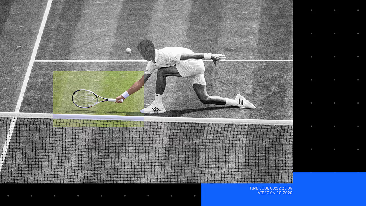
Masonry Grid
Standard Section
Archives


.gif)


.gif)


See more
See less
See more
See less
See more
See less
See more
See less
See more
See less
See more
See less
See more
See less