No items found.
No items found.
No items found.
No items found.
No items found.
Our original branding
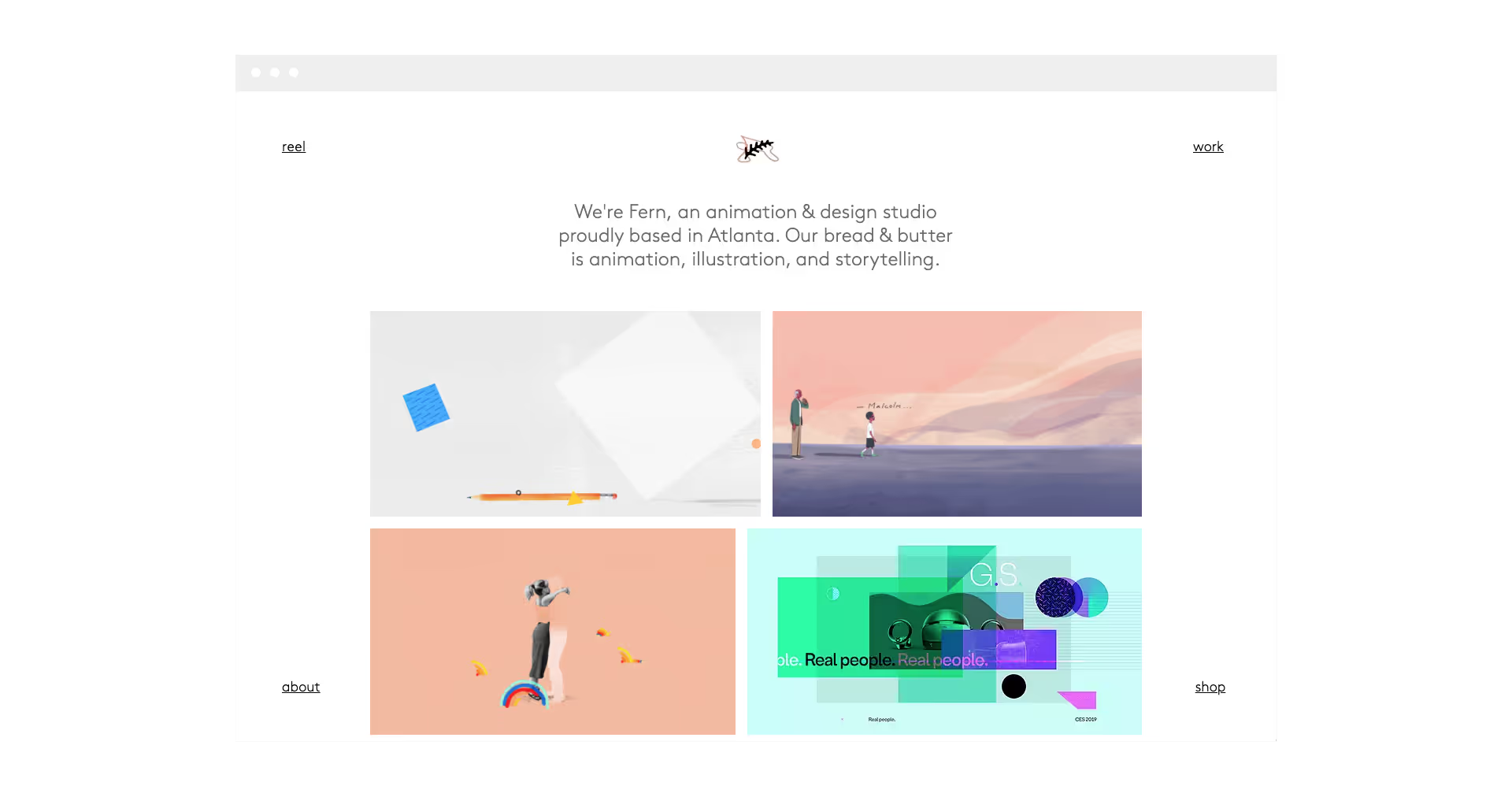
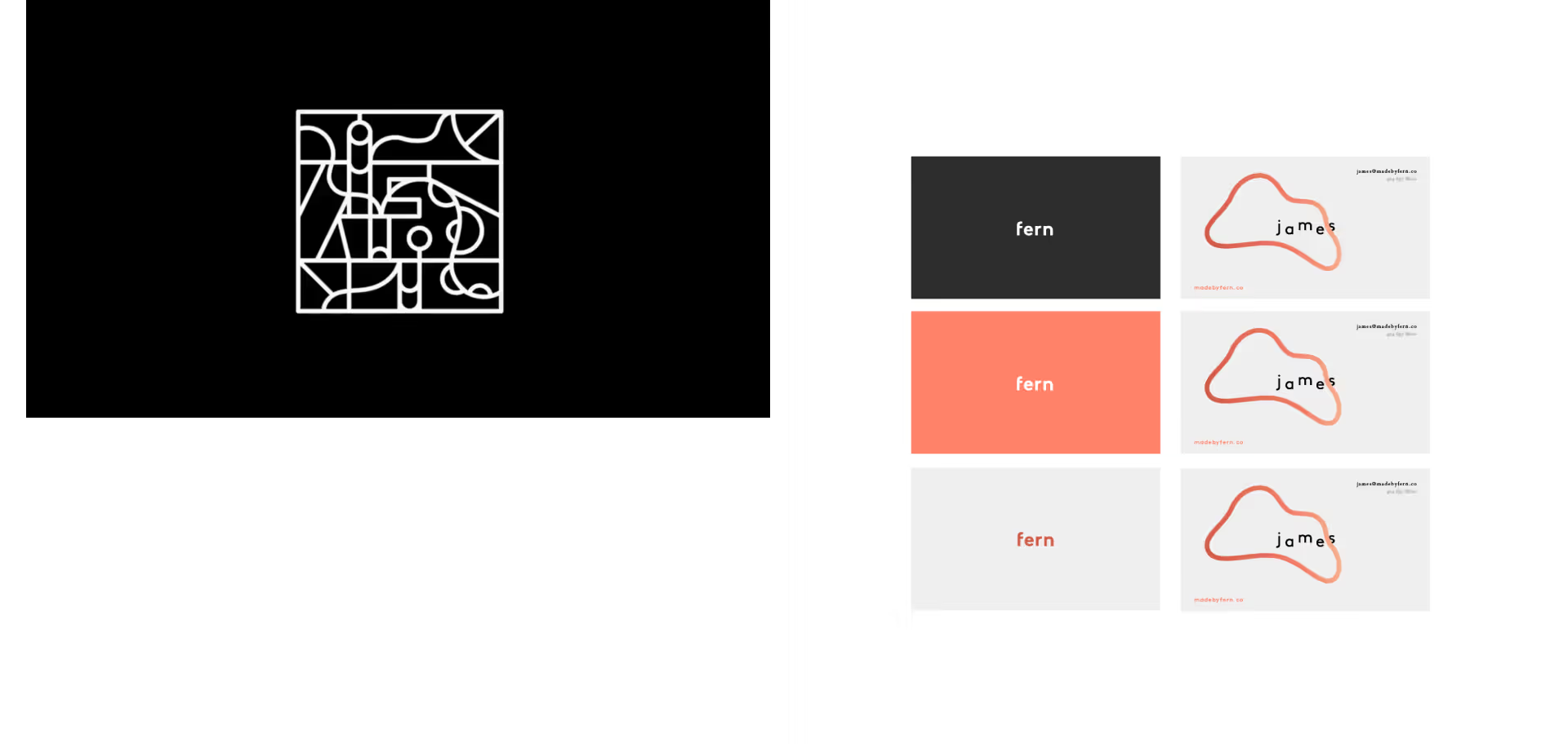
From the outset, our brand grew organically around the work we were producing.
It had plenty of good starts—the frond logo, interesting illustrations—but it lacked a cohesive structure.


No items found.


No items found.


No items found.


No items found.


No items found.
Our new branding
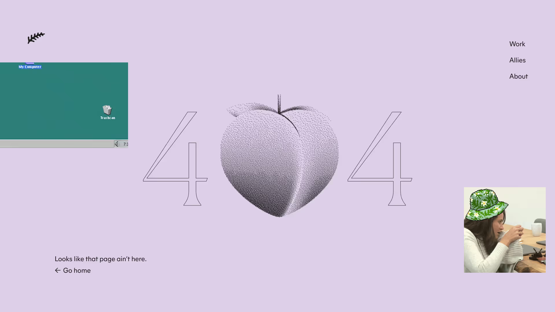
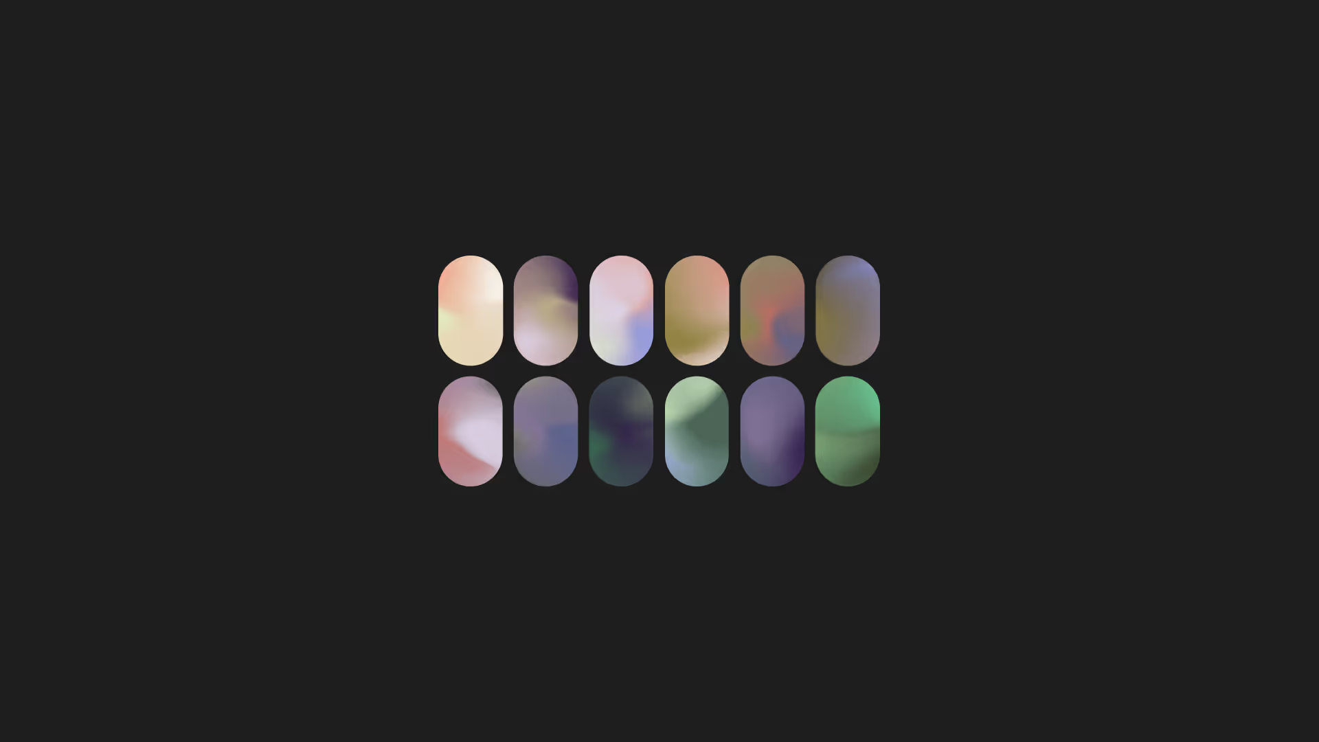
With the new brand, our goal was to maintain the personality and quality of the original work, but give it a more cohesive structure.
The new brand derives its foundations from the components of a fern throughout its life cycle, in combination with the foundational principles of animation and design.
The intent of the design language is to reflect the nature of the studio—humble, purposeful, inclusive, exploratory, and honest.
We’re always growing in a myriad of ways 🌱.




No items found.


No items found.


No items found.


No items found.


No items found.


No items found.


No items found.


No items found.


No items found.


No items found.